Water Can
INVOLVEMENT BRAND / DESIGN / ART DIRECTION / ANIMATION / PROJECT LEAD
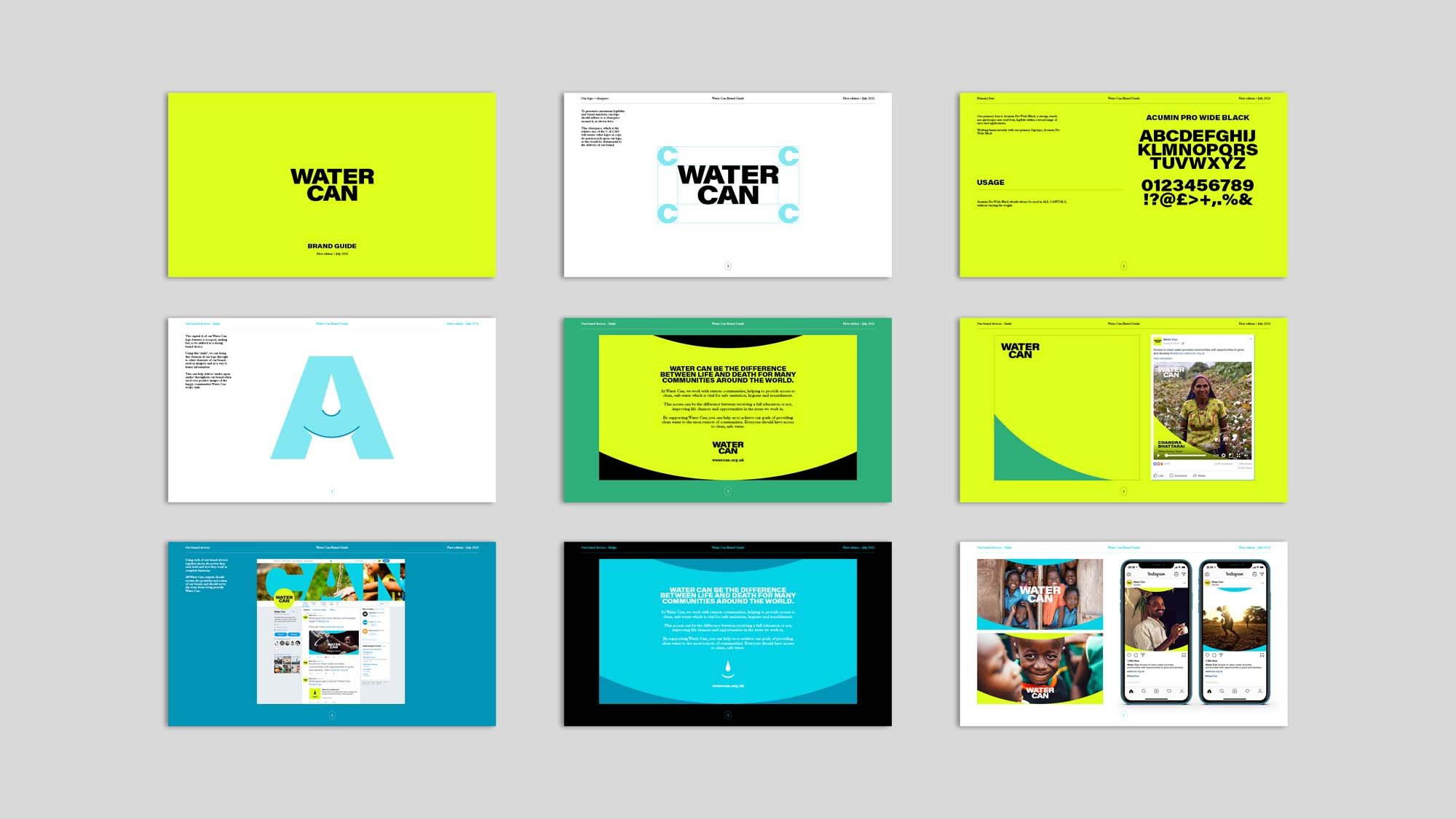
Water Can are a collective of five water charities - Just a Drop, Pump Aid, Dig Deep, Frank Water and Village Water. With a shared vision of helping to provide clean water, better sanitation and better hygiene, the Water Can campaign needed an identity to reflect its ambitions.
A bold, striking and functional logotype formed the backbone of the identity, with just the right amount of personality thrown in. Quite literally, the the two A’s within the logo feature a water drop and a smile, representing the positive change clean water can bring for people and communities.
Paired with a vibrant, energetic and youthful colour palette, Water Can stands to be more than what we have come to expect from water charities over the years. The five charities have shared goals and they are using their collective resources to meet them.
This work was completed whilst employed at Agent.